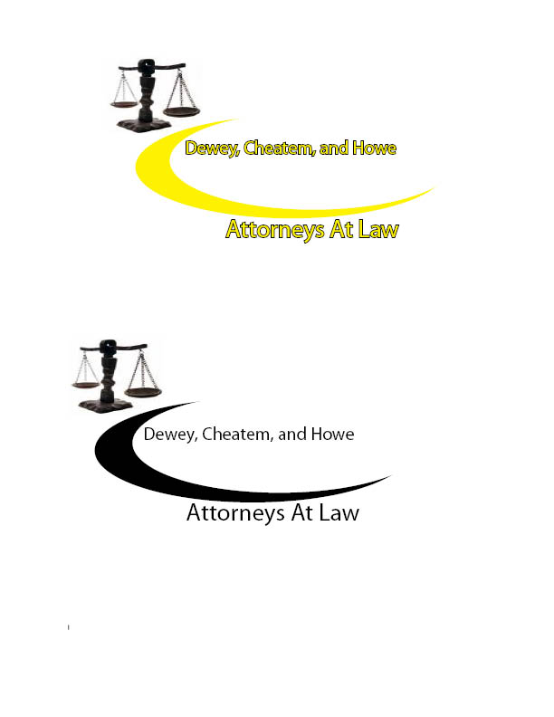
 Design 1-Logo
The law offices logo that I designed is for a local law firm. This design is eye catching and orderly. The design is meant to make the viewer comfortable. This design shows that the business is defiantly a legal firm because of the scales. The central point of this design is the names of the lawyers. I have also attempted to make the design attractive to the eye by adding in the curve. The font shows uniformity and order, something that law offices pride themselves on. This design is original to me as far as I know. Many law office logos are more formal than this one. I believe this logo conveys a more laid back atmosphere which makes the customer feel comfortable. Some of the elements of design that I have used are shape, texture, and form. The shapes that I am attempting to convey are serious where the name of the business is conveying the feeling of order and uniformity. The curve however is meant to be smooth ad convey a since of comfort for the viewer. The texture that I present in my design is in the curve. I have attempted to make the curve seem smooth to add to the visual appeal of the design. The third element that I have used is form I have used this element by rotating the scales towards the curve to make the eye move to the title. Some of the principles I have used are unity, balance, and emphasis.
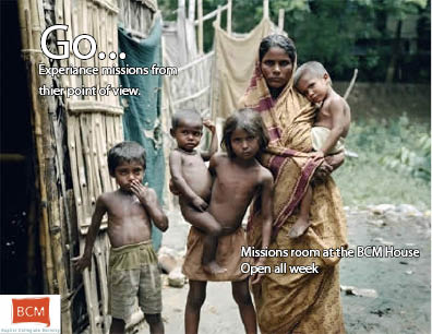 Design 2- Advertisement of organization’s event
The event that I chose is a real event that is from a real organization that I am a part of here on campus. The room that the team created is to simulate the environments of the people that are less fortunate than us and includes poverty, discrimination and human trafficking. The room is a promotion for international missions for students here in Charleston. I have attempted to recreate this theme to use for the advertisement. By putting a picture of a poor family in as the background and using a ragged looking font, I have attempted to visually show what the patron will experience when in the display. This design is not very original because hundreds of charity and missions organizations use this kind of design all the time. Regardless, the design is effective because it attracts the viewer’s since of sympathy. The viewer is more likely to do what the brochure says to help. This design features the elements of value, texture, and type. The value in this design is the picture in the middle, which is used to communicate need, fear, and helplessness which is meant to give the viewer a passion to help. The Texture in this design is in the type. The papyrus type is meant to look rough and shabby to highlight the picture of the poor family in the center of the design. Some of the elements that I have used in this design are design and emphasis.
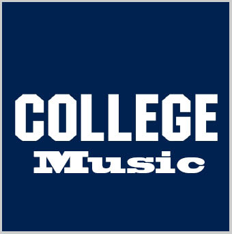 Design 3- Music CD cover
This music CD cover is for a compilation of music related to college. The design was based off Bluto’s sweater from Animal House. The Music under the College title is a font similar to the font used in the College sweater. This font is used for the song titles on the back cover also. The record company logo and the barcode are from Google images. The colors of the front are reversed on the back cover. And the navy blue becomes a secondary color. All of the tracks and artists on the back cover are fictional except Shout by Otis Day and the Knights. The audience of this CD would be College students. These students would be attracted by the image of Bluto’s sweater. Many products attempting to sell through college students have used pop culture symbols related to college such as this one. The elements I have used in this design include line, space, color, and shape. Line is used in the way that all of the content is presented in this design. All of the shapes are geometric and composed of lines. Space is used on the back color to highlight the music titles. Without the white space used, the song titles would not have shown up as well as they do. Color is used to balance the design. The colors balance out on the front cover by the reversal on the rear cover. The principles of unity that I have used are unity, balance, emphasis and functionality.
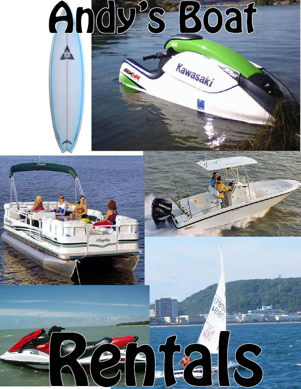 Design 4- Business Advertisement
In my business advertisement design, I chose a design that mainly focuses on the wide inventory of the company in question. By combining these pictures into a rough collage, I made the design visually appealing to the reader. The name of the company appears in large, black letters on the top and bottom of the page indicate the name of the business. The audience of this flyer would be attracted by the wide variety of boats offered and would have no question about where to get access to this variety. In my design I have incorporated the element of space. In the spaces around the boats I have incorporated various nautical scenes to aid in the renting of the merchandise. I also have incorporated shape into my design. All of the pictures in the collage are square to make customers feel like these pictures are photos of people enjoying the merchandise and other boats. This is to increase the appeal of the boats being rented. My design follows the principles of unity, variety, and originality. I have unity because all of these pictures are of boats that are available to rent. My variety in boats used also covers one element. The design featured is original I am the only person that I know that has used this same design. There are variants to this design but I believe this design is original to me.